
Salesforce Certified Tableau Desktop Foundations Questions and Answers
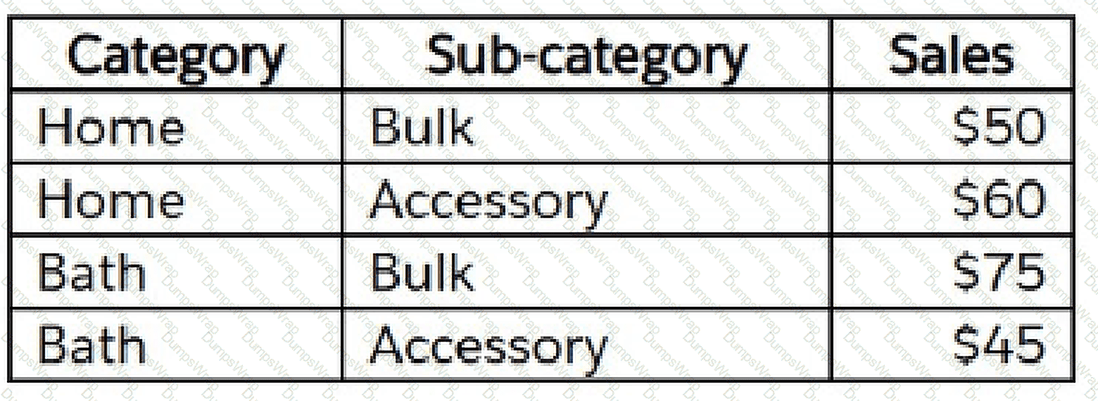
A Tableau associate has the following data.
The associate wants to sort each category's sub-category by ascending sales.
Which sort option should the associate use?
Options:
Manual
Data source order
Field
Nested
Answer:
DExplanation:
The correct option is Nested because the Sub-category members must be sorted independently within each Category based on Sales. A nested sort evaluates the measure separately inside each pane or parent dimensional grouping. In this example, the Home sub-categories should be sorted according to their Home Sales values, while the Bath sub-categories must be sorted independently according to the Bath Sales values. For Home, Bulk has Sales of $50 and Accessory has $60, so ascending order is Bulk followed by Accessory. For Bath, Accessory has $45 and Bulk has $75, so ascending order is Accessory followed by Bulk. This demonstrates why a single global ordering is insufficient: the correct Sub-category order differs between the two Category groups. A non-nested field sort can produce a consistent order based on aggregated values across the view, which would not satisfy the requirement to rank Sub-category independently inside each Category. Manual sorting would require explicit maintenance, while data source order simply follows the ordering supplied by the underlying source. Tableau's official sorting documentation states that nested sorting considers values independently per pane and sorts the values separately within those panes.
Which type of chart can a Tableau associate create without using a dimension?
Options:
Bar
Highlight table
Treemap
Stacked bar
Answer:
AExplanation:
A basic bar chart can be created from a measure without requiring a dimension, making A correct. Tableau can construct an initial visualization automatically when a field is double-clicked in the Data pane. Official Tableau documentation demonstrates that double-clicking a quantitative measure such as Profit automatically adds it to the view and creates a bar chart. At this stage, no dimension is required; Tableau displays the aggregated value of the measure as a single bar. The remaining visualization types fundamentally depend on categorical partitioning. A highlight table uses dimensions to establish the table's row and column structure and measures to encode values through color or text. A treemap normally requires one or more dimensions to define individual rectangles, with measures controlling properties such as size and color. A stacked bar requires a categorical field to partition a bar into multiple stacked segments. A dimension can certainly be added later to a basic bar chart—for example, Category on Columns and Sales on Rows—to produce multiple bars. However, the question asks which visualization can be created without a dimension. Tableau's official field-dragging documentation specifically demonstrates that double-clicking a measure alone produces an automatic bar chart.
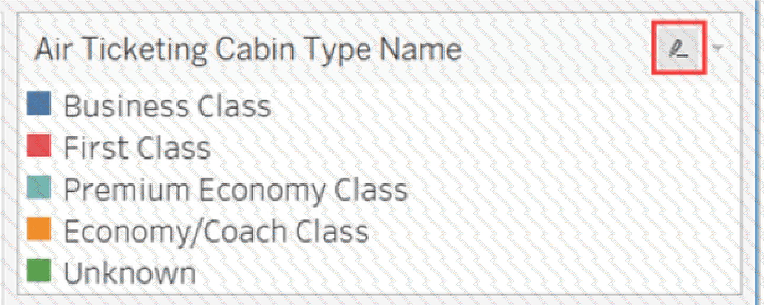
A Tableau associate has the following legend.
What occurs when the associate clicks the icon to the right of Air Ticketing Cabin Type Name?
Options:
The Edit Colors dialog box opens.
The filter options open.
The highlighter toggles on or off.
The legend toggles on or off.
Answer:
CExplanation:
The icon displayed to the right of the legend title is Tableau's highlighting control. Therefore, clicking it controls legend highlighting, making C the correct answer. Legend highlighting is an interactive analytical feature that allows the viewer to focus on specific marks associated with a selected legend member. When highlighting is enabled and a value such as Business Class or First Class is selected, Tableau emphasizes the corresponding marks while visually dimming unrelated marks. This makes it possible to investigate one category without filtering other categories out of the visualization. Tableau supports both one-way and two-way legend highlighting. The icon displayed at the top of the legend indicates the available highlighting mode. In two-way highlighting, interaction can occur from either the legend or marks in the visualization. The Edit Colors command is accessed through the legend's menu or other color controls, not by clicking this highlighter icon. Likewise, the icon does not expose filter settings and does not hide or display the legend itself. Official Tableau documentation explicitly states that the icon at the top of the legend represents legend highlighting and can be used to control highlighting behavior.
What are two methods for renaming a field in a visualization?
Options:
From the Data pane, right-click the field and select Replace References.
From the Data pane, click and hold on the field until the name is editable.
From the Data pane, use the field's drop-down menu and select Rename.
From the Format menu, select Field Labels.
Answer:
B, CExplanation:
Tableau allows a field to be renamed directly in the Data pane by making the field name editable or by selecting Rename from the field's contextual menu. Therefore, B and C are correct. For the first method, Tableau documentation specifies that the user can click a field name in the Data pane and hold the mouse button until the field name appears in an editable text box. The new name can then be entered and confirmed. Tableau also provides keyboard alternatives such as F2 or Ctrl+Enter. The second standard workflow is to open the field's contextual or drop-down menu and choose Rename. This changes the field name used within Tableau without changing the column name in the underlying data source. Replace References serves a different function. It substitutes one field for another throughout the workbook and is commonly used when replacing broken or obsolete field references; it is not simply a renaming command. Field Labels under formatting controls how field labels appear in a view rather than changing the Data pane field name. Tableau explicitly documents Data pane renaming and confirms that renamed fields retain the new Tableau-facing name within the workbook.
At a minimum, what does a Tableau associate need to create a simple scatter plot?
Options:
A dimension on Columns and a measure on Rows
A dimension on Detail and a measure on Columns
A dimension on Columns and a dimension on Rows
A measure on Columns and a measure on Rows
Answer:
DExplanation:
A basic scatter plot requires one measure on Columns and another measure on Rows, so D is correct. A scatter plot displays the relationship between two quantitative variables. One measure determines the horizontal position of each mark, while the second measure determines its vertical position. For example, placing SUM(Sales) on Columns and SUM(Profit) on Rows establishes a two-dimensional quantitative coordinate system. A dimension may then be added to Detail, Color, Shape, or another Marks property to create separate marks for entities such as customers, products, or states. However, that additional dimension is not the fundamental axis requirement identified by the question. The minimum structural requirement is two quantitative measures defining the x- and y-axes. A dimension plus a measure normally produces a categorical view such as a bar chart rather than a scatter plot. Two dimensions likewise do not supply the pair of quantitative scales required to analyze numerical correlation or distribution. Tableau's visual construction model distinguishes continuous quantitative measures, which generate axes, from discrete fields, which generally create headers. A scatter plot relies on two quantitative axes and therefore requires measures on both Rows and Columns. This is consistent with Tableau's standard scatter-plot construction methodology and its continuous-field behavior.
What are three ways to access bolding options for the text in a tooltip?
Options:
Hover over a mark and press CTRL+B.
Right-click on the Field and select Format.
Select Tooltip on the Marks card.
Hover over a mark and press ALT+F.
Select Format on the menu, and then select Font.
Select Worksheet on the menu, and then select Tooltip.
Answer:
C, E, FExplanation:
The three applicable routes are Tooltip on the Marks card, Format > Font, and Worksheet > Tooltip, so C, E, and F are correct. Selecting Tooltip on the Marks card opens the Edit Tooltip dialog. This editor contains text-formatting controls that allow tooltip content to be formatted, including the application of bold styling to selected text. Tableau also provides an equivalent route through Worksheet > Tooltip, which opens the same tooltip-editing environment for the current worksheet. A third route is through Format > Font. Tableau's worksheet-level font formatting includes a specific Tooltip section. This enables formatting of tooltip text at the worksheet level, including font style settings such as bold. This method is useful when a consistent tooltip font treatment is required rather than individually formatting portions of the tooltip body. The keyboard sequences listed in A and D are not defined Tableau methods for accessing tooltip formatting options merely by hovering over a mark. Right-clicking an arbitrary field and selecting Format is primarily associated with field/view formatting and is not the specified route to the tooltip bolding controls in this question. Official Tableau documentation confirms both Tooltip on the Marks card and Worksheet > Tooltip, while current Font formatting documentation exposes Tooltip as a configurable font target.
When using a data source that has relationships, how can a Tableau associate add a join between two or more tables?
Options:
From the Connections pane, select Add.
From the Tables pane, drag a table directly on top of an existing logical table.
Double-click a logical table in the canvas.
From the Tables pane, double-click a table.
Answer:
CExplanation:
To create a join in a data source that already uses relationships, the associate must double-click a logical table in the canvas, making C correct. Tableau's data model has two layers. The top-level logical layer contains logical tables connected by relationships. A join cannot be created directly between these logical tables because joins operate in the underlying physical layer. Double-clicking a logical table opens its physical Join/Union canvas. From there, the associate can drag or double-click additional physical tables and define the required join clauses and join type. This distinction is fundamental to Tableau's modern data model. Relationships connect logical tables while keeping them separate and preserving their natural level of detail. Joins merge physical tables into one logical table using an explicitly defined join configuration. Selecting Add in the Connections pane adds another connection; it does not itself create the join. Dragging a table directly onto the top-level logical canvas generally creates a relationship rather than a physical join. Double-clicking a table in the Tables pane is not the step used to enter the physical layer of an existing logical table. Tableau's official documentation explicitly instructs users to double-click a logical table to open the physical layer where joins and unions can be created.
A Tableau associate needs to share a workbook with a user who does NOT have access to the underlying data. The user must be able to modify existing visualizations.
What should the associate do?
Options:
Save the workbook as a .twbx file.
Save the workbook as a .twb file.
Create a .hyper file.
Export the views.
Answer:
AExplanation:
The associate should save the workbook as a Tableau Packaged Workbook (.twbx). A packaged workbook can contain the workbook itself together with copies of supported local data sources, Tableau extracts, background images, and other workbook resources. This directly addresses the scenario because the recipient does not have access to the original underlying data. When appropriate data is packaged with the workbook, the recipient can open the workbook in Tableau Desktop and interact with or modify its existing worksheets and visualizations without requiring the author's original file paths. A .twb file contains the workbook definition but normally references external data rather than packaging the required local resources. Therefore, it would not reliably solve the access problem. Creating a .hyper file alone provides an extract but does not contain the complete Tableau workbook, including worksheets, dashboards, calculations, formatting, parameters, and visualization definitions. Exporting views produces presentation-oriented outputs and does not satisfy the requirement to modify the existing Tableau visualizations. Tableau specifically recommends packaged workbooks when sharing with someone who does not have access to referenced resources or the original environment.
What are two outcomes when a Tableau associate drags a continuous date value to the Rows shelf?
Options:
The date part is displayed as labels.
The pill on the Rows shelf is green.
A quantitative axis is shown.
The pill on the Rows shelf is blue.
Answer:
B, CExplanation:
A continuous date field produces a green pill and generates an axis, making B and C correct. Tableau uses color as an immediate visual cue for discrete versus continuous fields. Green pills represent continuous fields, whereas blue pills represent discrete fields. A date can function in either form. When the analyst chooses a continuous date value such as continuous Month or continuous Year, Tableau represents the field as an unbroken temporal range rather than a finite collection of date-part headers. When this continuous date is placed on the Rows shelf, Tableau generates a continuous axis corresponding to the selected temporal granularity. The axis behaves similarly to other continuous quantitative axes in the sense that values occupy positions along an uninterrupted scale. Option A instead characterizes a discrete date part, such as discrete Month, where Tableau creates categorical headers or labels like January, February, and March. Option D is likewise associated with discrete fields because discrete pills are blue. Tableau's official Continuous Dates documentation states that continuous dates create an axis and that converting a date field to continuous causes the field to turn green. Tableau's general field-role documentation separately confirms that continuous fields create axes while discrete fields create headers.
A Tableau associate has a continuous numeric measure named Sales.
Which chart type is created when the associate double-clicks the Sales measure?
Options:
A line chart
A pie chart
A bar chart
A text table
Answer:
CExplanation:
Double-clicking a continuous numeric measure such as Sales in an empty Tableau worksheet automatically produces a bar chart, making C correct. Tableau uses intelligent defaults when fields are double-clicked in the Data pane. With a single measure and no dimensions already defining the view, Tableau aggregates the measure—normally using its default aggregation such as SUM—and adds it to the visualization. The Automatic mark type resolves to a bar, producing a single bar representing the aggregated Sales value. Tableau's official documentation provides this exact construction using the Profit measure. It states that double-clicking Profit automatically adds the field to the view in an intelligent way, and the documented resulting visualization is a bar chart of Profit. Sales is the same type of field—a quantitative measure—so the same automatic-view rule applies. A line chart ordinarily requires an ordered dimension such as a date field to provide a sequence across which values can be connected. A pie chart requires additional categorical structure for meaningful segmentation. A text table is generally created when a dimension is double-clicked first and subsequent fields refine that cross-tabular structure. Therefore, a lone continuous numeric measure double-clicked in a new worksheet produces the automatic single-measure bar visualization.
A Tableau associate needs to display the complete list of potential data connections when connecting to a server.
Which action should the associate perform?
Options:
Select Connecting to Data.
Select File on the menu, and then select New.
Select More under To a File.
Select More under To a Server.
Answer:
DExplanation:
The associate should select More under To a Server, making D correct. Tableau Desktop organizes available connectors on the Connect pane into broad categories such as To a File and To a Server. Frequently used server connectors may be displayed directly, but Tableau provides the More option to expose the complete list of supported server-based connection types available in the installation. Official Tableau connector documentation repeatedly states: For a complete list of data connections, select More under To a Server. This workflow is used when locating database and server connectors such as Microsoft SQL Server, PostgreSQL, SharePoint Lists, and other supported platforms. Selecting More under To a File instead displays file-based connection types and therefore does not satisfy a requirement specifically involving server connections. Choosing File > New creates a new workbook and does not expose the complete server connector list. "Connecting to Data" is not the command required to reveal all server options. This distinction is operationally important because the Connect pane intentionally surfaces common connector choices while More exposes the broader connector catalog. Current Tableau documentation for multiple server connectors confirms the More under To a Server workflow for viewing the complete connection list.
What is a Tableau story point?
Options:
An individual sheet or dashboard in the story
A collection of talking points to drive the story
A collection of sheets arranged in a sequence
The pane where the size of the story is set
Answer:
AExplanation:
A story point is an individual visualization state within a Tableau story, normally represented by a worksheet or dashboard. Therefore, A is correct. Tableau defines a story as a sequence of visualizations that collectively communicate information, provide context, demonstrate relationships, or support a data-driven narrative. Each individual sheet contained in that sequence is called a story point. A story can contain multiple points, and each point can present a different worksheet, dashboard, filter state, annotation, or analytical stage. Option C describes the overall story, not an individual story point. The distinction is important: the story represents the complete ordered narrative, while the story point represents one step within that narrative. Option B is not an official Tableau object or definition. Option D refers to controls within the story workspace and does not define a story point. This functionality allows an analyst to guide viewers through findings in a controlled sequence while preserving interactive visualization capabilities where supported. Official Tableau Desktop documentation explicitly states that a story is a collection of sheets arranged in sequence and that each individual sheet in a story is called a story point.
